
Zippy Kids
Activities Planner App
UX/UI Case Study
My Role Problem Solution
As a solo UX/UI designer, I was responsible for the entire process, from defining the idea of my project to testing and improving the final version of the prototype.
Based on my own experience and research, I concluded that many parents at least once a day think that they lack the necessary knowledge, imagination, and sometimes just time to find suitable entertainment in particular for a preschool child.
My concept is to help find in a short time more effective activity options and help parents and children spend time more productively.
Design Process

USER RESEARCH
Goal Methodology Result
To find out as much as possible about how parents usually spend time with their children and what difficulties parents face when looking for entertainment for their children.
Read more about my research
I created a screener survey with the help of which I identified candidates for future interviews. I chose four people out of 13 respondents of children aged 2 to 6 years old who have difficulties finding exciting activities for children.
During the interview, I received many insights that helped me understand my users better. Affinity Map helped me to gather qualitative information about my users and group it by category with sticky notes.
PERSONA & EMPHATHY MAP
With the Empathy Map tool, I visualized what I learned about the users during the interview. I have reproduced what they think, feel, say, and understand the problems or concerns they have right now. The research helped me also to create a realistic representation of my crucial audience. On this basis, I made two personas. I divided them into two different groups (“Busy Parents” and “Engaged Parents”), which allowed me to understand my user’s needs better, experiences, behaviors, and goals.

GROUP #1
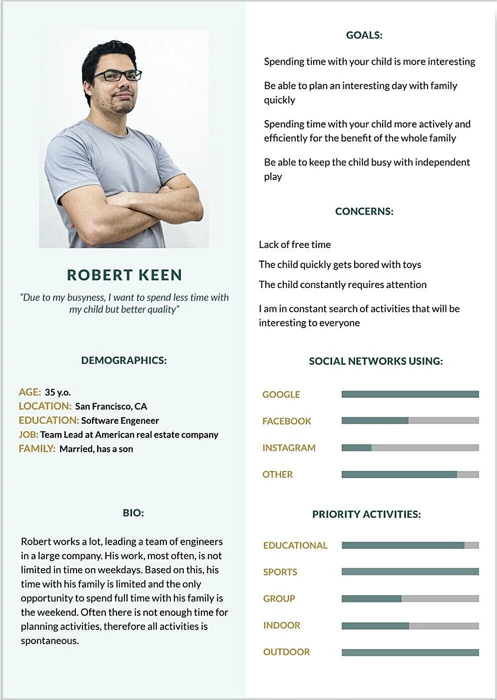
“Busy Parent“. Persona Robert
Full time working parent;
Has not much time with the kid but aspires to high quality;
Using the internet to optimize activities;
Prefer sports and educational activity.

GROUP #2
“Engaged Parent“. Persona Anna
Housewife spends plenty of time with kids;
Runs out of activities - wants more options for safe outdoor activities;
Prefer hiking and group activities.

USER STORIES & USER FLOWS
After brainstorming and the early ideation stage, I made the list of solutions. I decided to create an Activities Planner app for Kids aged 0-6 years by combining several ideas from this list. I created User Stories to show the possible ways users can interact with a product and prioritize them to the list of MVP requirements, ideas, and features. And then, based on this, I created 4 User Flows (you can see the picture below) to identify the actual customer journey within the product.

SKETCHES & WIREFRAMES
The next step was to illustrate my idea with simple sketches. These were my first ideas about what features I will implement into the application, how screens can potentially look. Below you can see an example of one of my red routs.

Red Route #1. Sketches. Explore popular activities near you and add to your calendar a “Halloween Party” event. More sketches here.
Before I started prototyping and figure out how straightforward and convenient the application is in use and to understand common problems, I did low-cost Guerilla Usability Testing.
Guerilla Usability Testing Findings
Sections on the Home page were not clear;
The title of the sections on the Home page does not correspond to the content.
After that, I started to create low-fidelity prototypes that contained the primary content of my application to represent my high-level design concept. At this stage, my wireframes differed from the sketches after the Guerilla Usability Testing because some significant problems were found that made it difficult to use the application. I decided to completely redo the home page, focusing on the user's functions every time he wants to create or find desired activities and add them to the calendar.
Red Route #1. Low-Fidelity Wireframes Explore popular activities near you and add to your calendar a “Halloween Party” event. More lo-fi prototypes here.
VISUAL DESIGN
Before I started to create high-fidelity prototypes, I was thinking about the visual side of my project. First, I decided on the name. I choose the name of the application-Zippy (fast or speedy) Kids., then I drew a logo. The logo reflected the meaning of the app, which is a collection of ideas, activities for kids and parents. I chose bright but not flashy colors, and I created illustrations that brought life to the application, identity and indicated that this application is for parents and children.

*Full style guide you can find here
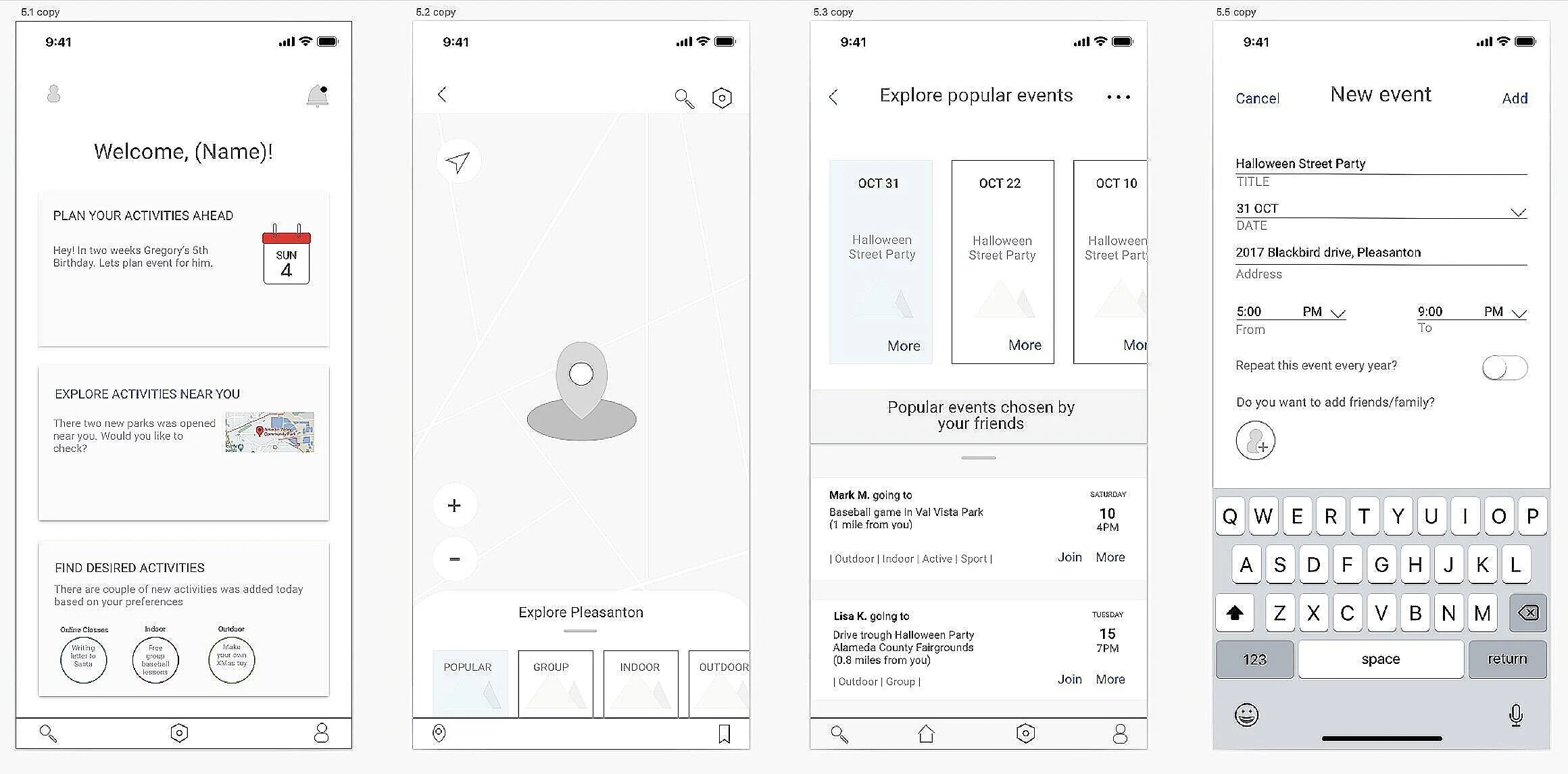
PROTOTYPE
High-fidelity prototypes will allow the end-user to see the look and feel of the final product. I include actual content, typefaces, colors, image dimensions, and branding elements.

Red Route #1. High Fidelity Wireframes. Explore popular activities near you and add to your calendar a “Halloween Party” event. More hi-fi prototypes here.
TESTING
After prototyping, the visual elements of an application needed to be tested to validate whether they accurately meet the expected performance and functionality. I wanted to see the reaction of potential users, see how they interact with the application, and collect feedback to understand how I can improve the application. I wrote a usability test plan and started recruited 5 participants.
App User Testing Round #1
There were 2 tasks to complete (2 red routes) which in my opinion were important.
Task #1: Plan Activity for the current day. Add to your calendar Online “Reading Class“.
Task #2: Explore activities near you. Add to your calendar “Street Halloween Party”.
The full version of the Usability Test report Round #1 you can find here.
Participants selection criteria: Goals:
5 participants;
Parents and has children aged 0-5 years;
Interested in finding new entertainment for kids.
The convenience of Zippy Kids application;
Access to the basic features of the application;
How design affects user experience.
App User Testing Round #1 Findings
The User tried to click on an icon that was not clickable while trying to complete a task;
Participants going down the wrong path doing unnecessary actions and could not return to the home screen.
Improvements
Made elements on the main page clickable;
Added additional screens and functions;
Reduced the time to complete the tasks by implementing new features.
App User Testing Round #2
Before the Zippy Kids Application has launched, I retested the Zippy Kids application prototype. I recruited people among personal contacts. Each session took about 20 min. Each session will conduct in-person. The full version of the Usability Test report Round #2 you can find here.
Participants selection criteria: Goals:
5 participants;
Parents and has children aged 0-5 years;
Interest in finding new entertainment for kids.
See how the participants will interact with the application after new features are implemented;
How convenient are the new features;
How does the addition/removal of functions affect the execution time of the task?
App User Testing Round #2 Findings
The respondents took less time to pass the tests;
The introduction of new features allowed users to finish both tasks without problems;
After redesign overall user experience has become more positive.
Improvements
Made the Home button clickable on all screens so that the user can return to the Home page at any time;
On the screen with online classes made a more precise separation between them;
Added the ability to see the feedback when the user clicks on the “Repeat event every year.”
CONCLUSION
Zippy Kids is my first project, which I did myself from when I defined the problem to the final prototype.
I chose a topic that was close to me as a parent. At some point, I noticed that sooner or later, all parents in my environment face the problem of finding a suitable activity for their child. This project's complexity was that it was necessary to create a prototype for the app that would be understandable for adults and easy to use but visually straightforward that it was about children. I wanted to make an app that was functional and interesting. That's why I used my illustrations. Research and testing played a significant role in how the prototype will look now. Zippy Kids app helps parents without spending a lot of time finding the most suitable activity for a child to spend time in a quality and enjoyable way.